


Cloud Drawing Across Media
Pastel, pencil, watercolor and gouache: technique, play, observation

I spend as much time as I can outside. Since I’m preparing for my PhD exams and up much of the night with a teething baby, though, my time outside tends to come as part of something else. I’m walking to class, or beelining around our apartment complex in an attempt at exercise, and almost never feel I have the luxury of enough time to pull out my sketchbook.
So I make an effort to look, knowing that the constraints I have now will not always apply, and that someday it will pay off that I have noticed again and again how oaks make their edges, or how clouds spread across the sky.
I also take pictures of shapes and colors and phenomena that strike me, “hearting” them on my iPhone to make them easier to find later. When the day has darkened, I sometimes get the chance to sit with these photos. When looking at them, I try to remember what it felt like to stand before the pictured thing. Then I draw.
Making satisfying depictions of clouds has tended to be a process of subtraction. When I made this study of Conrad Nagel Doman Theys’s painting “Namib Landscape,” I laid down a wash of blue in the sky area,and then pressed a paper towel over most of it to bring much of the top half of the paper back to white. Then I followed suit with gray, again removing most of the wash.

While the paper was still damp, I went back in with more gray, adding finer details.
In watercolor, I tend to mix green or red grays (using a combination of the primaries), since I prefer skies with more depth of color.


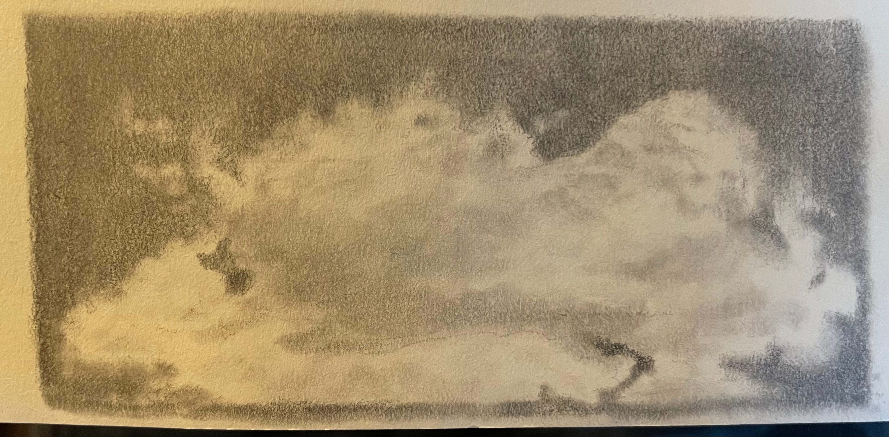
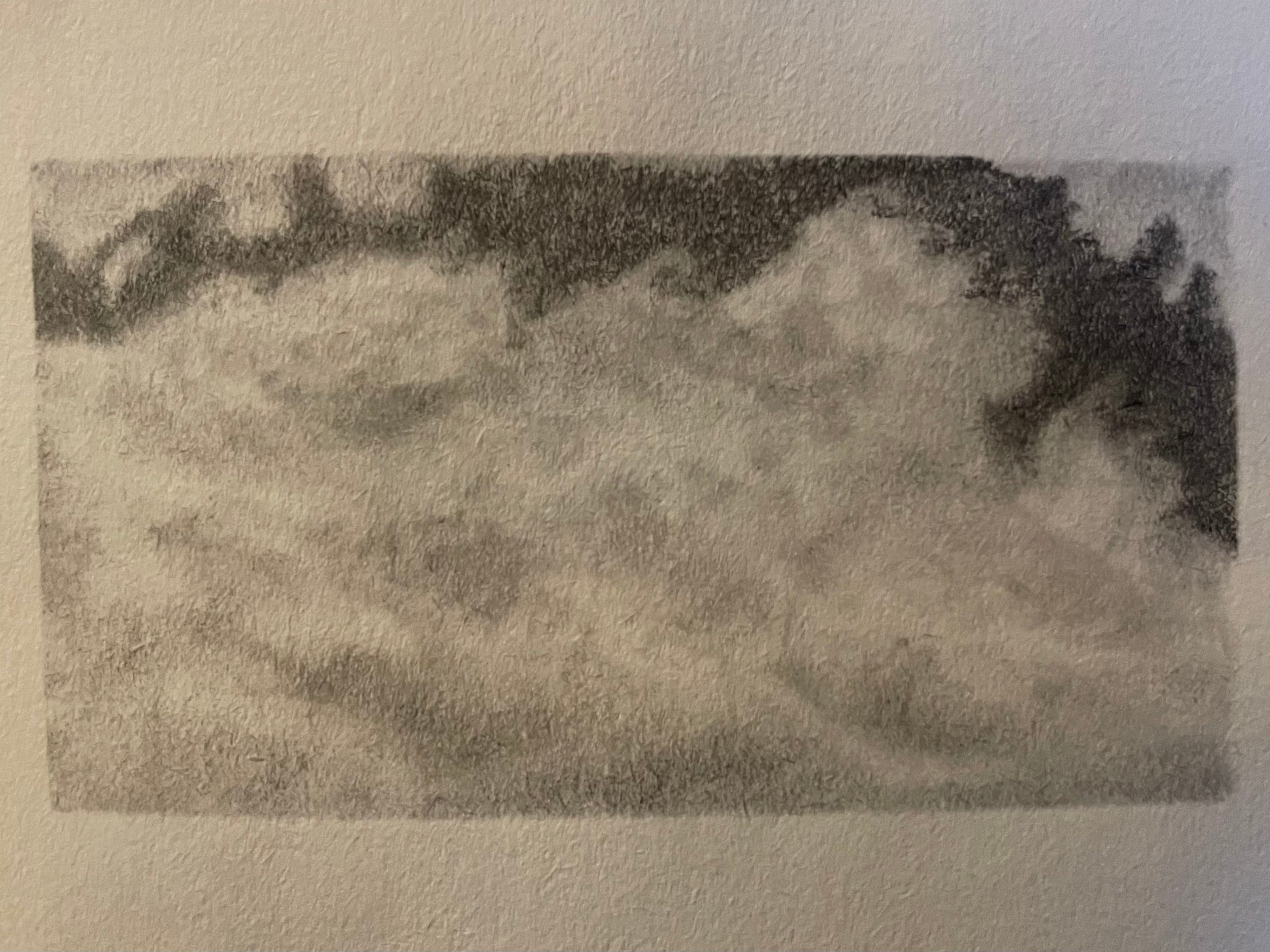
With the two pencil sketches above, the process was similar to the one I’ve used with watercolor, but involved erasing the paper back to white in certain areas rather than blotting, and smearing the graphite to make the shapes appear more organic.
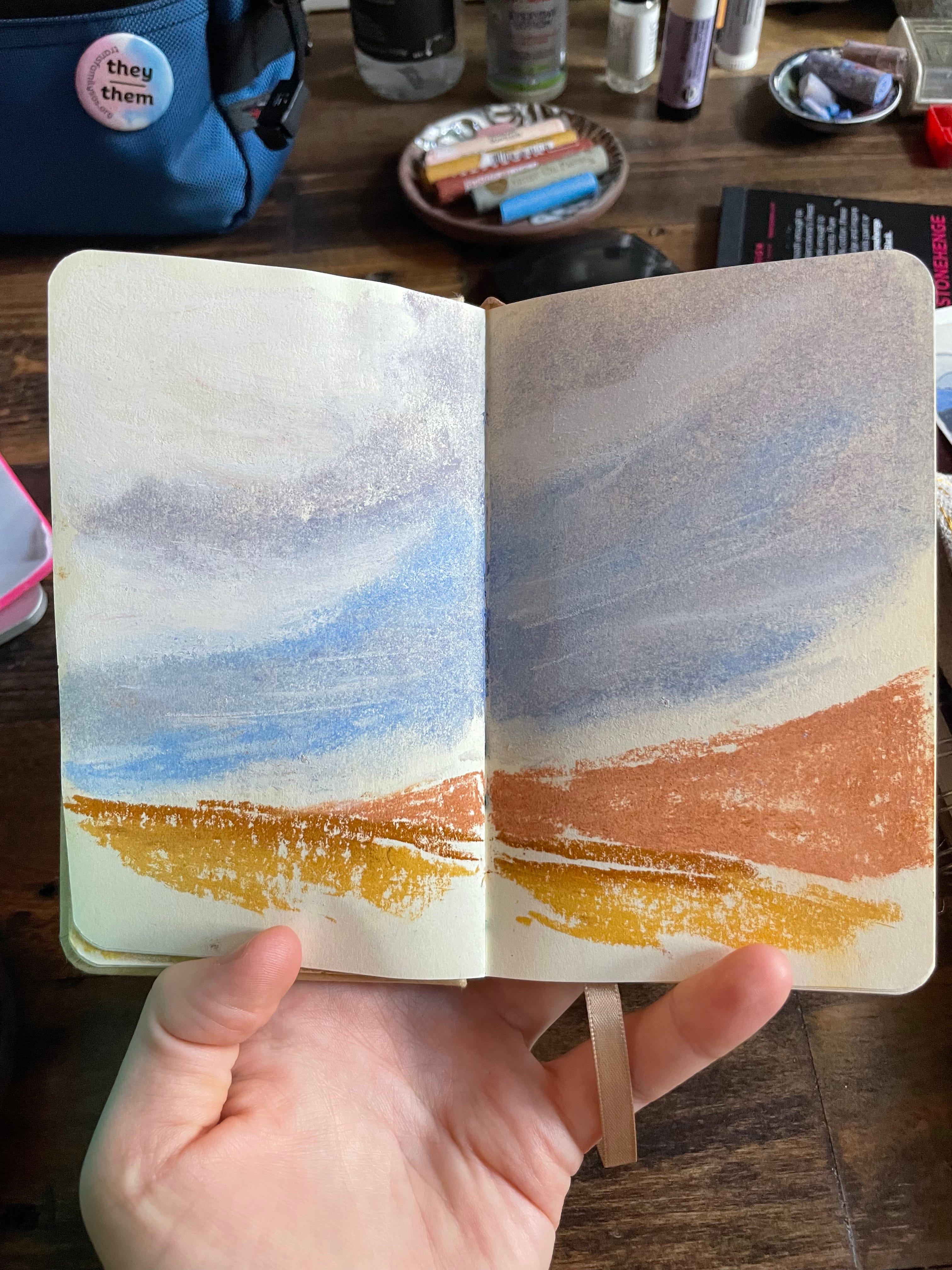
Soft pastel is by far my favorite medium to work with, especially when drawing skies. I love its textures on the page, the ways I can blend it, and the vivid color choices available. It’s also the medium I reach for the least because it’s pretty messy and I’m pressed for time. Still, I did the above cloud drawing in under three minutes, and quite enjoy the effects. This is a reminder to pull my pastels out more often.
Making clouds in this medium can be additive rather than subtractive. I can easily lay down a vibrant, multicolored sky and then go back in with white. Or I can leave the blank paper, as I might with watercolor, and simply blur the edges of the colored-in areas to make a cloud shape.
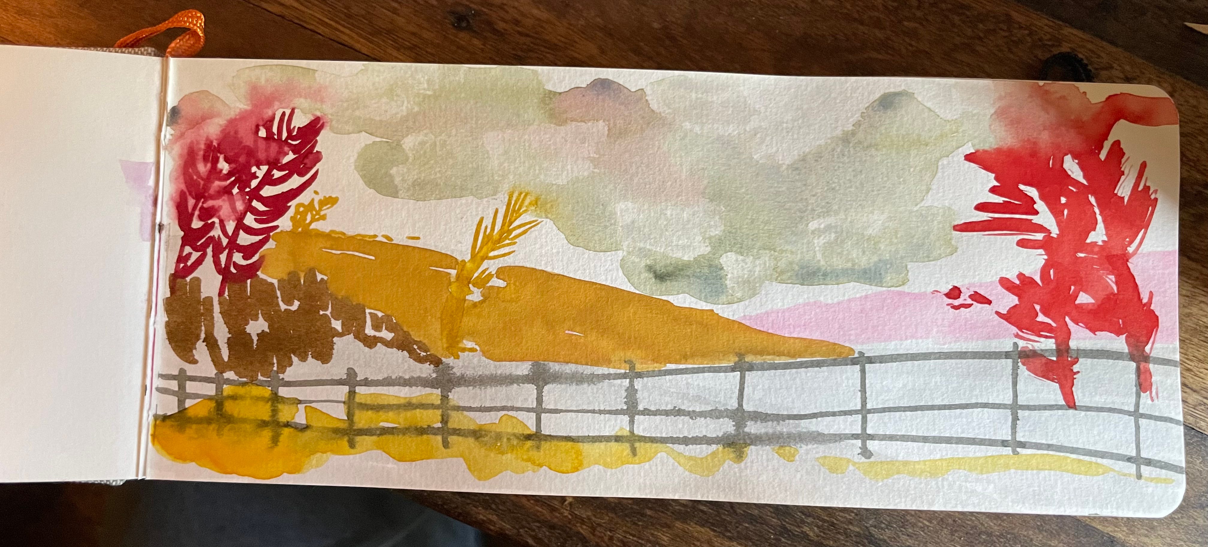
I’ve also been trying out gouache clouds, to see what I can do with more opaque paint. I discovered (by “accident” during a play session—a painting moment when I had no plan) that I enjoy painting with a flat brush and/or folded paper towel to create blocky skies.


Hope you’re finding the time to look up.
—sarah